The color story from this line is one of my favorites. I love the combo of teal, green, black, yellow and how it's complimented by the woodgrain. It provides such a great starting point for boy photos. The first of the pages I put together was for TJ -- documenting him at six years old. As you'll see, I enjoyed using and layering lots of the stickers from this line and couldn't get enough of the decorative brads, as well.
The globe sticker was a favorite of mine. I was certain to include it on TJ's page because he is so into maps, wanting to know about other countries and just an 'explorer' in all sense of the word!! So, I thought it was the perfect accessory to a page of him at this age!
Did I mention that I liked the decorative brads?! Again the globe one was a favorite! I think I squeezed seven of them on this one page.
Now it's Justin's turn. I had more than one photo that I wanted to use on his page, and the filmstrip sticker strip proved to be the perfect way to add them onto this page. I simply sized down the photos to fit inside the filmstrip frames, before printing them.
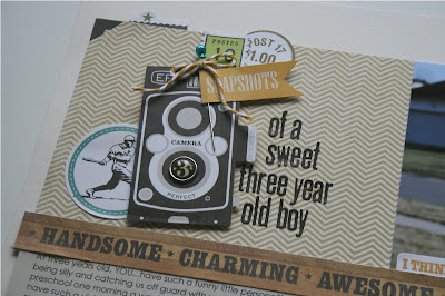
After starting with that cute filmstrip, I decided to continue with the photography theme of the page and built my title element on top of that darling vintage camera image and cute little banner with the word 'snapshots'. I added the 'three' brad onto the camera lens, as that's Justin's age and dressed up the banner with a stick pin and baker's twine.
Again, more vintage cameras -- with the use of one of the paper borders. I also pulled out my Technique Tuesday Ali Edwards, 'Life in Pictures' stamp set because it perfectly complimented this page. I used the filmstrip, photo corner and this darling phrase, from the set.
I even put together this quick card with some of my leftover pieces.
I have quite a mess to clean up in my scrapbook space, with all of the projects I've been putting together. So, I'm off to clean that. I'll be back soon with more to share. As always, thanks for stopping by! I love to hear your comments -- so thanks so much to those who do!


Gosh, these might be 2 of my favorite layouts of yours right now! I've been looking at this line and I like it a lot more than the girl line. Great job!
ReplyDeletePatti -- you're so sweet! These are two of my favorite recent pages too -- doesen't hurt that the subjects are so cute, huh?! If you do purchase some of these papers, I've got plenty of extra embellishments to share!
Deletethese are great jaclyn! they will be up on the simply blog later this week! starting thursday- sunday your week is being featured!! loved everything!!
ReplyDelete