Gams

Showing posts with label color photos. Show all posts

Friday, February 19, 2016

My Love List & Love Cards: My Creative Scrapbook

It's Friday and I'm here to share the last of my February main My Creative Scrapbook kit projects with you.  The first is a simpler page that documents a recent favorite photo of my daughter and I and my list of current 'loves'. 

Because the background paper I chose was so very busy, I chose to keep my design simple and limit my embellishments.  A kraft background is always a good go-to neutral when designing with lots of color and pattern. The extra added papers, diecuts and stickers are all more on the solid side and tie back into the different colors from the background paper.


With my kit leftovers, I created two quick cards for my sweet valentines.  I couldn't resist making this cute and funky porcupine the focus of one of my cards.  Isn't he fun?!


And I'm pretty certain this one will have to go to my hubby!  I love those lip stickers!

 
Thanks, as always, for joining me on my blog today.  I hope you have a happy weekend, filled with all things crafty!
 

Thursday, February 18, 2016

XOXO: My Creative Scrapbook

Good morning! I'm not quite done sharing my February My Creative Scrapbook kit projects with you. This kit was jam packed with items, and even after creating four pages and two cards I still have leftover items!

I love stretching the contents of a kit and making each page so very different from the last.  So far I have shared two pages featuring pictures of my daughter, because the color palette is so very girly.  However, the kit also works great for documenting those you love!  This page features a date night selfie of my husband and I.


It's no secret, I love labels!  Most of my pages include at least one. I cut apart the labels from one of the patterned paper sheets and used it to scatter my journaling down my page.  I mixed in some of the sticker and diecut labels for added pops of color and interest.  Machine stitching adds extra texture and interest to the design.


I'm sharing a tutorial over on the My Creative Scrapbook blog today for a couple of simple ways to alter your wood veneer shapes and sentiments.  It's certainly not a difficult process but can produce customized results, as I've done for my page title here.

Gold glitter embossing powder gives an extra pop to the 'XOXO' wood veneer and ties back in with the other gold elements on the page.

 
Thanks for visiting me today!  I'll be back tomorrow with the last of my projects created with the MCS February Main kit.
 

Wednesday, February 17, 2016

Hello Sweetie: My Creative Scrapbook

I'm back again today with another fun page created with the My Creative Scrapbook February Main kit.  This page is a little different for me but I really loved how it turned out!  There were so many pretty patterns in the We R Memory Keeper's Crush collection, that was the focus of the kit, I wanted to find a way to include as many of the prints as possible.  A heart punch and a top to bottom nestled heart pattern was the perfect formula.


When laying out my heart design, I made sure to keep an eye on color placement and ensure that each pattern was evenly dispersed and represented.

Lining the hearts up with one row upright and the following row upside down, allowed me to nestle the rows closely among one another.  This not only tied the rows together but creates a fun and unexpected element on the page.


Page titles are not my strong suit, so I looked to the contents of the diecut pack to give me a little help and inspiration.  Lucky for me there was the perfect option.  Since the two words I planned to use were different colors, I picked an additional diecut element (the butterfly) which had colors from both words, to compliment and tie the full title together.  A pretty dimensional ribbon bow was the perfect finishing accent to my title treatment.
 
 
I hope this page inspires you to get crafty!  See you tomorrow with more MCS kit projects to share!

Tuesday, February 16, 2016

I love your face: My Creative Scrapbook layout

It's my second month guest designing for My Creative Scrapbook and I am truly having so much fun with these kits!  The February Main kit is filled with items from the We R Memory Keepers Crush collection and wood veneers from Crate Paper's Hello Love.  As you might assume, there was certainly a love/valentine theme throughout the kit, but even so, I found it to be quite versatile and actually didn't even scrap a stitch of Valentines!

This page documents a recent favorite photo of my daughter and LOTS of journaling.  I wanted to record all of the little bits and pieces that make her who she is at four years old.


That floral watercolor paper was the inspiration and starting point for my page.  I knew it would pair nicely and be the perfect contrast to the denim and woodgrain in my photo. 

I loved the patterning and gradient of color on the sticker/chevron arrows.  Not only do they add a fun accent to the left column of the page, but they direct your eye to the important stuff - the story!


I loved putting together this cluster of elements on the right side of my photo.  Again, I started with the watercolor flower diecut, knowing it  would be complimentary to my photo and background.  From that point I played around with different sticker, diecut and dimensional embellishments until I landed on a pretty cluster of elements that wasn't too overdone.  The wood veneer arrow, again, directs your eye to focus of the page and the sweet 'I love your face' text sticker acts as a subtle page title.


Thanks for joining me today!  I'll be back again tomorrow with another page created from the My Creative Scrapbook February Main kit.


Monday, February 15, 2016

Ten: A Just Nick Layout

Good Monday morning!  I'm excited to get this week started because I've got a week's worth of projects to share with you! So, make sure you stop back by each weekday to see what's new.
 
Over the weekend I shared a project for the Just Nick Studio / Clique Kits blog hop.  If you missed that post and page, and the details of how to enter the giveaway, you can find it here.  I had so much fun pairing the kit contents and exclusive cut files that I couldn't stop creating and combining the two!  So, I'm sharing another page that resulted from this team up on the Just Nick blog and here, today.
 
 
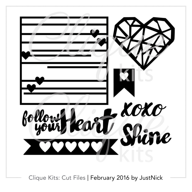
CK_Feb16-CutFiles2
I used the bannered heart design, from the exclusive set of cut files, to cover the majority of the background.  I chose to forgo the banner style ends, and instead cut them off for a clean and straight edge.  The resulting cuts were sized at approximately 7.75"x1.5".  I cut five of them, from white cardstock, to fill my background.  Layering them atop of one another and under my picture creates cohesion throughout the design.


The open hearts were a great place to introduce lots of color and pattern from the kit papers into my design.  I even used the included sequin mix to back some of my hearts and add a little extra detail and shimmer. 

Some foam mounted stickers, stictching and a Thicker title were the finishing touches atop my background design.


The combination of the Hot Mess kit and Just Nick designs is a pretty perfect pairing, wouldn't you agree?  The are both so full of product, design and versatility, that I've got one more page combining the two that I will share with you later in the month.
 
I hope to see you back here tomorrow as I start to share the projects I've made with My Creative Scrapbook's February Main kit!

Sunday, January 10, 2016

My Creative Scrapbook Layout: Dance Forever & Disney

Happy Sunday,  I hope you are enjoying the last bit of your weekend!  We got our first official snow of the winter and have been thoroughly enjoying it!  We spent the morning watching it fall out our windows, then bundled up and played in it after lunch.  Now we're inside again warming up with cocoa.  Pretty perfect Sunday, if you ask me!  It would be completely perfect if I could squeeze in a little scrapbooking time, so that is next on the agenda!

But before I do that, I thought I'd share with you, the last of the two pages I put together with My Creative Scrapbook's January Main kit.

One single, sweet diecut was the inspiration for this page.  See the round 'dance forever' diecut in the bottom right corner of my page?  Right when I saw it, it reminded me that I was still waiting on the perfect product to scrap my little girl's dance pictures.


The 3x4" Happy Place collection brag cards and diecut pieces were my favorite parts of the kit.  In fact, the brag cards made for a quick and easy grid style layout to my page.  They were the perfect surface to add bits of my journaling, extra embellishment and layers.


The last page I created from the kit, makes a bold statement using the diecut letters as both my title and background.

 
I just couldn't resist those letters!  The font and the colors are just perfection and both paired nicely with some of my favorite family Disney memories.  While this page has no real title - the page theme is clear, by the words used to 'mat' my photos.


Again, I snuck in more diecuts and button embellishments to accent my page.


 Thanks for joining me today!  I hope the rest of your weekend is cozy and crafty!
 

Wednesday, January 6, 2016

My Creative Scrapbook Layout: A Perfect Snap

As promised, I'm back today with one of the layouts I created for my guest stint over at My Creative Scrapbook

If you have children or at the very least, have tried to take a picture with 2 or more, you know what a challenge it can be.  It's darn near impossible to get everyone smiling, happy and looking at the camera at the same time, am I right?!  That 'perfect snap' is my one and only wish each Mother's Day, and as you can see, it's often hard to come by.  But the outtakes are part of the memory, so I thought they would be fun to include on this page.


The Fancy Pants 3x4 Brag card made for the perfect title for my page, even if it hints at a bit of sarcasm!  The quotations reinforce the tongue and cheek nature of my title, in addition to the added text I included by running the 3x4 card through my printer.


This paper collection includes so many great diecuts that I tried my best to squeeze in as many as I could.  Layering the diecuts among the 3x4 cards, photos and themselves ties all of the elements of the page together and gives them each a home.


Thanks for stopping by today!  I'll be back again tomorrow with another kit page to share!
 

Monday, December 28, 2015

This Is 2015: A Just Nick DT page

Hello blog friends!  All this week on the Just Nick blog, we're focusing on remembering and reflecting.  In doing so, I have been flipping through the photos on my phone from the past year.   I uncovered so many gems that had not yet been printed, soI decided to make a page featuring some of the highlights of our year. This page will serve as the title page for my 2015 family album. 


Supplis used: Simple Stories - patterned paper, bradz, stickers, diecuts; Fancy Pants - buttons; Tim Holtz - mini attacher; Bazzill - cardstock;  Other: foam adhesive, machine stitching


I used three different files from the Just Nick store to create and customize my design

The 'This Is' portion of my title was taken from the Arrow Set 1 cut file. The original arrow design used in this file was much thicker and shorter.  However, I wanted to use a longer, thinner title that would stretch the width of my page and not get lost in my grid of photos.  To create that effect, I borrowed one of the longer, skinnier arrows from the All Boy file and sized it to my desired length.


I completed my custom title by including the year.  Lucky for me the Right Now Cards design included a bold, chunky '2015' that I was able to snag and incorporate into my design.


I hope this page reminds you that you can make your cut files work for you!  Adjust their sizes, widths and even combine files for a completely fun and custom look!

I'll be back soon with more to share.  In the meantime, happy crafting!

Wednesday, October 21, 2015

Adventures Ahead: A DCWV DT Page

The warm temperatures and sunshine are long gone, and that of course, has me wishing I could have the lazy days of summer back!  Since that's not possible, I've been busy reminiscing through our summer photos.  In doing so, I ran across these pictures of my little girl riding her bike.  I instantly thought of DCWV's Hello Darlin' stack and knew they would be a perfect match - both in color and in theme!


Supplies used: DCWV Hello Darlin' stack; American Crafts cork heart stickers and twine; Kerri Bradford Studio stamps and cut files; My Mind's Eye flair; Heidi Swapp glitter stickers; Crate Paper gold clip; Becky Higgins Project Life date stamp; Studio Calico wood veneer; Other: Stampin Up scallop border punch, Veteran Typewriter font, Hero Arts ink pad.
I built my entire page around the subtle horizontal pink and white stripe paper.  The text, near the top of this particular page, made for an obvious and easy page title.

I knew I'd need a pop of bright pink on the page and this pattern from the stack, did just the trick.  I cut it down to 3X4" and embellished it with a foam mounted word diecut and a gold embossed stamped sentiment, both designs from Kerri Bradford.
 

The kelly green and gold polka dotted pattern is my favorite from the whole stack.  I couldn't leave the page alone, without sneaking a bit of this pattern on there somewhere.  Again, I trimmed the patterned paper piece to 3X4" and embellished it with a clip and some flair.  Additional layers to the left, create some added interest and depth.
 

There was no way I could finish this page without using the remainder of the pink and white striped pattern, which includes a large gold foiled bicycle.  Since I had already cut down that paper, however, I had to come up with an interesting way to include the piece back onto my page.  I trimmed the front half of the bicycle off, and aligned the remaining piece up just below my journaling.  Not only does the bicycle reinforce the theme, but it also creates movement through the page, and well, it's just so darn cute!
 

Tuesday, October 20, 2015

Always Legos: A Just Nick DT Page

Good morning!  A couple of weeks back I was thrilled to be included on the 'Boys 2 Men' themed week on the Just Nick blog!  With two sons, I have plenty of rough and tumble pages to scrapbook.
 
It has been awhile since I made a page for my oldest son's album.  Now that he's 10 the picture opportunities with him are fewer and farther between.  Fortunately, I had managed to capture this recent picture of him with one of his latest lego creations.  Since this is such a big part of him and what he enjoys, I knew it deserved to be highlighted in his scrapbook.
Supplies used: Just Nick open triangle cut file; American Crafts thickers; Studio Calico patterned paper; Echo Park patterned paper; My Mind's Eye patterned paper; Doodlebug Designs enamel dots; Other: machine stitching and Veteran Typewriter computer font.
I used the Open Triangle cut file to fill the background of my page.  I cut various sizes of the triangles out of white cardstock and used a combination of both the positive and negative cuts.


Filling the insides of the open triangles with varying patterned papers provides a fun way to add color and embellishment to the page.  I dug into an older Studio Calico 6X6" patterned paper stack and the Echo Park Teacher's Pet collection to fill my empty triangles, embellishing some of them with enamel dots and/or machine stitching.


My title and journaling are both tone on tone, to keep the focus on the picture and design.


Thanks for joining me today!  I hope you are finding some time to get crafty this week!

Friday, June 26, 2015

Swim Everyday: A SCT Published Page

Happy Friday!  It's looking like a mostly gloomy and rainy weekend here, but that won't stop me from sharing a bright and summery page today.  I was fortunate to have this page published in the Reader's Gallery of the summer issue of Scrapbook and Cards Today magazine
 
Supplies used: Pink Paislee - patterned paper; Die Cuts With a View - Cardstock; MAMBI - transparent arrow diecut; Kerri Bradford - stamps; Project Life - date stamp; Hero Arts - ink; Stampendous - embossing powder; Heidi Swapp - acrylic letters; Simple Stories- label sticker; Doodlebug Designs - sequins, enamel dots; Studio Calico - flair; Other: crochet thread, silhouette, foam adhesive, machine stitching, computer journaling.
 
The idea for this page, originated from this sunburst design you see on page one of the two page spread.  I loved all the gorgeous, summery prints in the Pink Paislee Hello Sunshine patterned paper pack.  The sunburst allowed me to include several designs on the page.  I trimmed various lengths and widths of the papers and arranged them to mimic sun rays.  Placing my photos at the rays intersection point, draws attention to them and keeps the pictures the focus of the page. 


I had several more photos from our lazy summer pool days, that couldn't be left out.  A collage of images was the obvious solution.  I used larger pieces of the same patterns and papers from the first page to tie the two together.  Layering the papers created a fun and organized backdrop for my photo heavy page.


I scattered bits of sequins, flair and enamel dots throughout the two page design.


The ledger style paper was the perfect neutral canvas for my lengthy journaling.  I turned my journaling on the vertical, to squeeze it into the design and not take any space away from my photo collage.

 
The weather themed tags were made from the chalkboard print paper in the Hello Sunshine paper pack, and Kerri Bradford's amazing stamps!  I just love how they fit in with the theme of the page, and they couldn't be cuter stamped and embossed in white!

 
The title is made up of a variety of mediums - transparent and diecut letters and a script silhouette cut. 

 
Want a closer look at this page and lots of other inspiring artwork?  You can download your own FREE copy of the summer SC&T issue right here or better yet, subscribe and receive your very own paper copy in the mail every quarter!  It is such a beautiful and well put together magazine and this issue in particular is full of inspiring projects and ideas.  I can assure you, you won't be disappointed!

Monday, June 15, 2015

U...Right Now: A Just Nick DT page

Happy Monday! I announced in my post yesterday that I'm part of the the inaugural Just Nick design team.  Today is my first official post on the Just Nick blog, where I'm sharing this page starring my handsome six year old.  Isn't he cute, faux hawk and all?!


Supplies used: Just Nick cut files - Right Now, All Boy; Jillibean Soup -patterned paper, diecuts, stickers, enamel stars; Crate Paper - transparent letter; American Crafts - thicker, twine; October Afternoon - sticker labels, buttons, flair; Zig - Wink of Stella brush pen; Teresa Collins - enamel dots; Other - machine stitching, cardstock, foam adhesive, Veteran Typewriter font, date stamp, black ink pad.
I love adding pages to my kid's scrapbooks that highlight their interests, hobbies and personality traits for each year of their life.  The Right Now cut file, reminded me that I hadn't yet put together a page for my son's sixth year, since it was the perfect title for this type of 'highlight' page.

I love the mix of type in this cut file - it includes both a clean type and funky script.  The original design also includes a circle around the entirety of the design.  However, since I knew I'd be using a lot of linear elements on my page, I opted to remove the circle and simply cut the words.

Once sized, I cut the title two times - once out of cream cardstock and a second time from gray cardstock.  I layered the two cuts together, slightly offsetting the top piece, to create some added shadow and dimension.

 
The majority of my page is pretty busy and colorful, so I opted for a kraft background to ground the whole design.  With the cardstock background in place, the margins of my page still created a little more white space than I was going for.  To solve that problem, I cut some stars from the All Boy cut file out of the same kraft cardstock and layered them over the background piece to create a tone on tone effect.  To make those diecut stars pop just a little bit more, but still not overwhelm the remainder of the design, I colored them with a layer of Wink of Stella brush pen glitter.  The end result turned out to be subtle but cool!
 
 
The fun mix of patterned papers on this page can't be forgotten.  They are all from Jillibean Soup's 'Cool as a Cucumber Soup' collection.  I loved all the patterns so much, I cut 2" squares of my favorites and placed them in an incomplete grid on my background.  Lots of stiching and embellishments tie the entire design together!
 
 
Thanks for joining me today!  I hope you'll stop by the Just Nick blog and let me know what you think of my first post!