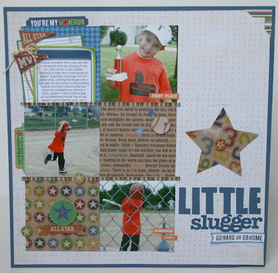
If you've visited my blog at all in the past, you know that I'm a fan of clean lines, multiple photos and often a bold title. So, as you can assume, I had no trouble at all pulling together a page based on this sketch. I pulled out my stash of Jillibean's Game Day Chili collection, some older photos of TJ's first tball season and went to work.
The 'Bite Size Bits' provided the perfect space necessary to sneak in my journaling on the page. I accented that area with a couple of three dimensional pennant flags that I cut from the border paper and adhered to an ordinary old toothpick to mimic a stick!
It can't hurt to add some foam dots and starry bling to emphasize the theme of 'all star', can it? ;)
That's not all I've got for today's post. I realized while pulling my images and creating my supply list for this page, that I somehow missed posting sketch #143 to the blog. Better late than never, huh? This one was by JJ. Again, another fun linear design with the option for quite a few photos.

I pulled from my Jillibean stash again for this page. I had been hanging onto this darling strawberry paper from the Coconut Lime Soup collection, and after our summer adventures going berry picking, I knew I had the perfect match!
The title features Jillibean's kraft corrugated alphabets, which I distressed with brown and white pigment ink pads. I couldn't resist the addition of a couple more 'toothpick' banners on this page as well. Are you noticing a theme? When I like something, I LIKE something!
I used a label from Martha Stewart's office supply line, that I found at Staples, to add some additional text/journaling, and softened it up with a sweet little flower.
I hope after you are done here, you stop over at the LCTS blog, check out the other designers amazing work on the current sketch and play along!


super cute!!
ReplyDelete