I've been digging through some older photos as of late to try and jump start my creativity. The busyness of this time of year, always seems to zap my mojo a bit. I thought giving myself some new 'old' material might inspire me in a different way and so far, so good!
This first page features pictures of my oldest son when he was just about to turn four. He's now nine - where does the time go? Waaaaahhhh!
Easy to see where the cute factor comes in, isn't it?!? It's everything Doodlebug, of course! Speaking of digging out the old to use as new, again - that's just what I've done with this Doodlebug collection. I've had it in my stash for many years, and used it on several projects. It's just so CUTE though, I couldn't resist revisiting it. The colors and feel of this line were a perfect match to these favorite photos of my sweet little guy!
I had fun digging through my stash of Doodlebug paper scraps to piece together these patchwork squares. A little bit of stitching and strategic embellishing, finished them off quite nicely!
I even dug into my stash of old, old chipboard alphas (these are from the Target dollar spot, of all places) to help spell out my son's initials for the title. I simply coved them with coordinating Doodlebug paper and dressed them up with some stickers and enamel dots, to ensure the title fit seamlessly onto the page.
I did the same with this ampersand, nestling it on top of the Crate paper chipboard frame and alongside my journaling. More stickers, a twine tied button and some sequins make the perfect little accents.
Don't worry the CUTE doesn't stop there,;I have one more page to share! It's another layout documenting some memories and pictures from two summers ago and more cute Doodlebug paper, of course!
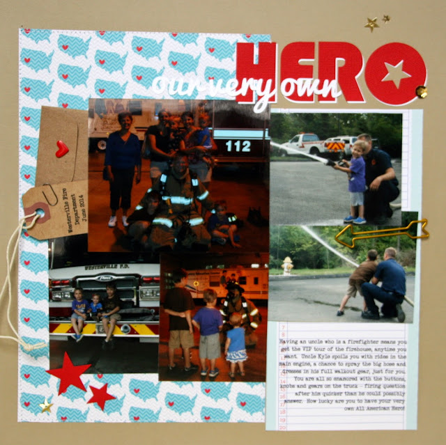
My brother-in-law is a fireman, so my kids are always treated to the VIP tour of the firehouse on our trips up north. This sweet USA print from Doodlebug worked great to pair with these pictures of their very own hero!
While this page remains fairly simple I added a few fun pieces, like this arrow clip from Freckled Fawn, to jazz it up a bit.
If your couldn't tell from some of my recent posts, I have a slight addiction to cutting out custom titles on my Silhouette. I love that I can adjust the size and the font to perfectly suit my project. Throw in a few sparkly sequins and the page is complete!
Thanks for stopping by! Hope your Monday allows for some crafty time!


No comments:
Post a Comment